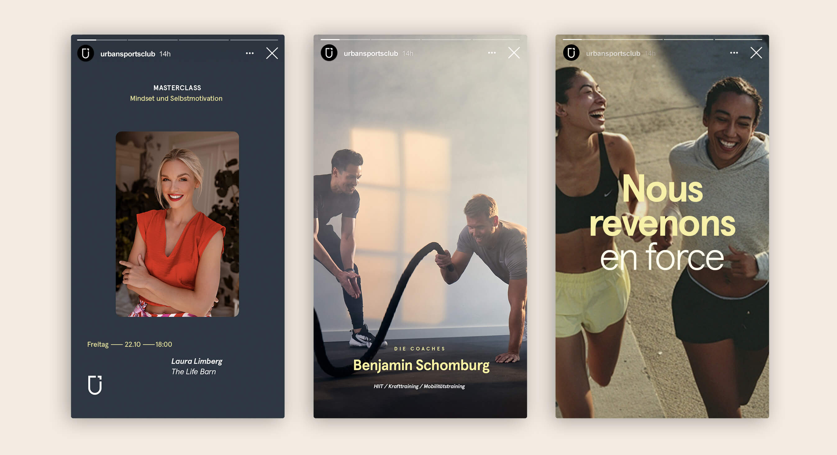
Typography

Our typography is a unique custom font based on the original Aperçu designed by Colophon Foundry. It was chosen to fit our visual language and slightly changed to be coherent with our Logotype. Aperçu Aktiv allows us to be versatile enough to create hierarchy in all our communication, while still having a strong character, consistency and clarity.

Download Assets

Hierarchy & Weights

Aperçu Aktiv offers a large number of weights. The most common weights to use for our brand are bold and regular. The Bold version is most often used for headlines, and regular for small copy. Use contrast between heavy and lighter weights to communicate relevant importance, otherwise known as hierarchy of information.

Usage

In order to keep things easy, try to use no more than 3 different font weights from our brand type in the same communication. Whenever you have to use a different font weight to communicate, always try to create a hierarchy by skipping one weight. (Ex. Regular - Extra light - Bold)

Tracking

Tracking is the amount of space given to an entire group of letters in a word.

When using Aperçu Aktiv for headlines, always use the Bold weight with optical kerning and -25 tracking. Whenever using the Regular weight, keep the tracking at 0. All headlines need to be set in sentence case, do not use all caps.

Paragraph Leading

Leading is the space between lines. When creating paragraphs make sure to use a leading that is coherent with the type size, and does not feel either too tight or too loose. Below are some examples to serve as guidelines to show both correct and an incorrect usage of paragraph leading.

Key Points

Not all typography aspects are addressed in these guidelines. Try to have the following key points in mind when using our type and find a solution that feels coherent and consistent with the brand. You can always use as reference examples created by the Brand team.

1. Headlines

When using Aperçu Aktiv for headlines, always use Bold style with optical kerning and -25 tracking. 
All headlines need to be set in sentence case, do not use all caps. 

2. Stay Left Aligned

Since most people read from left to right, we should align our type accordingly.

3. Contrast

Contrast is the key to make a piece of text easy to scan and read. Playing with size and weights will help to do so. When in doubt, skip a weight when pairing two weights, and double the size between two text elements (Headline - Paragraph).

4. Line Length

It is easy for the user to get lost in long lines of text, and short ones are easily ignored. It’s best to keep lines between 45 and 70 characters long, depending on the size of the font. This will ensure legibility as the font sizes increase or decrease.

Typography Misuse

Do not use unauthorized typefaces.

Keep tracking, kerning and leading reasonable and legible.

Avoid using strokes and shadows with typography.

Do not distort typography in anyway.

Keep the text size legible.

Do not use colors with low contrast.

Applications