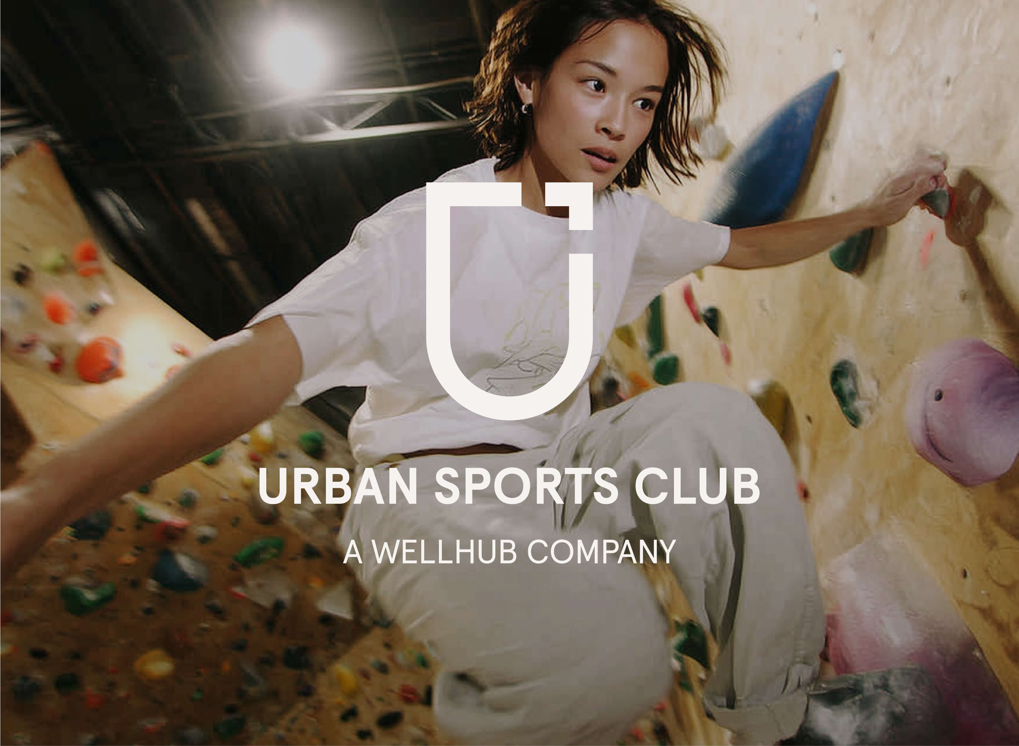
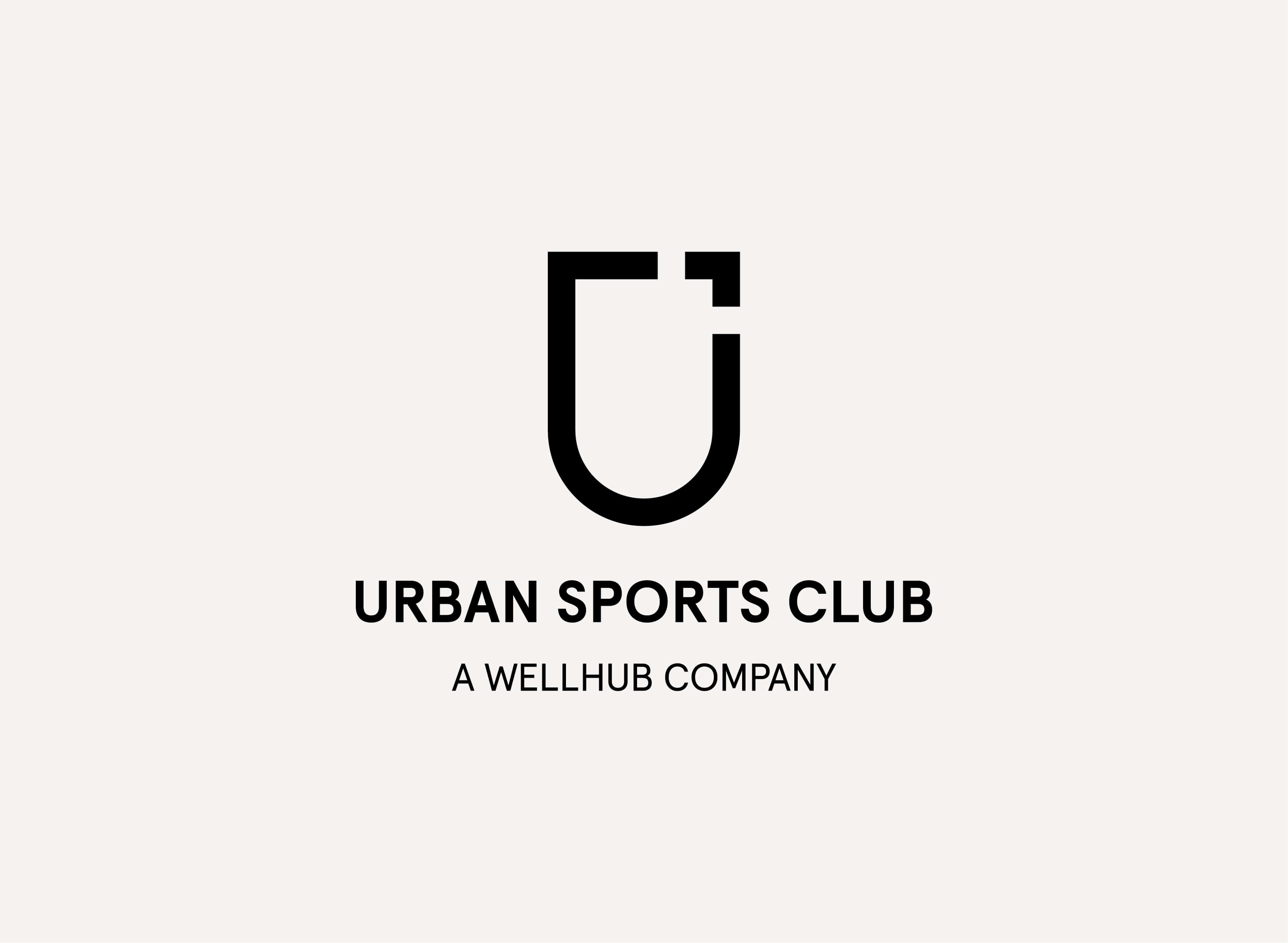
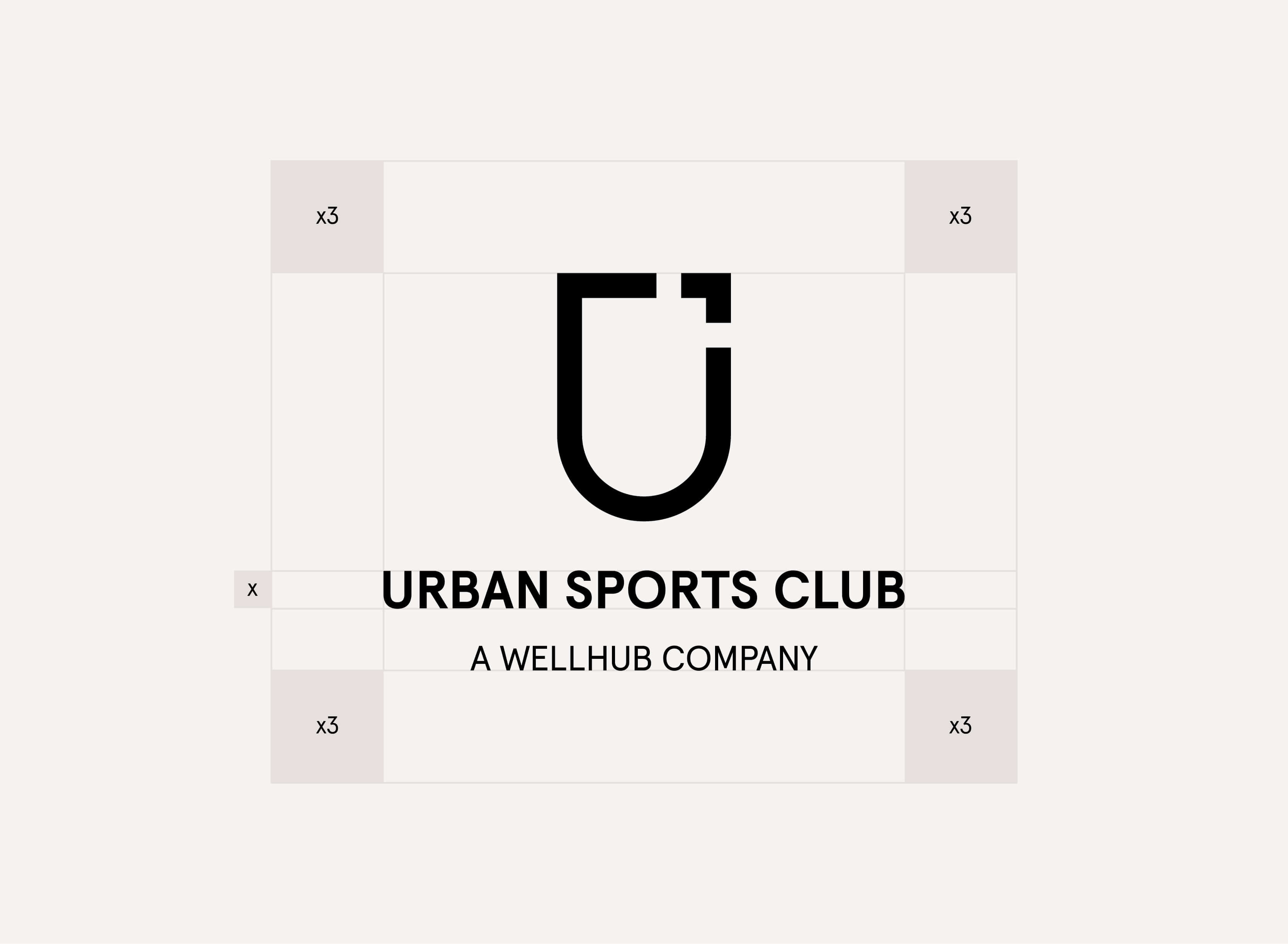
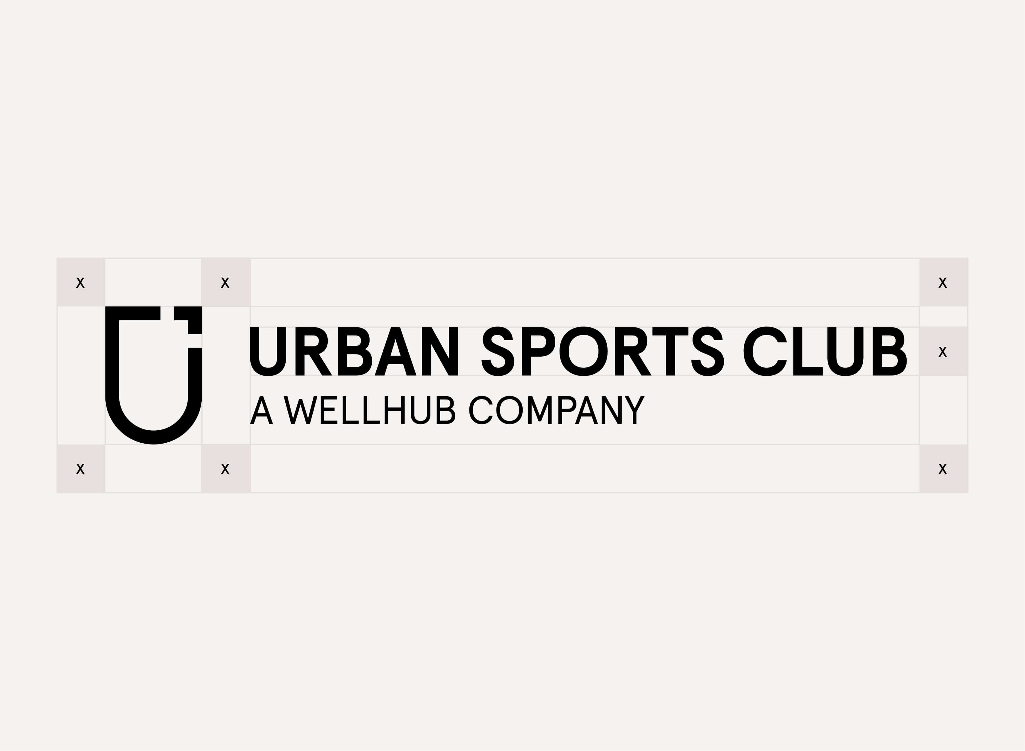
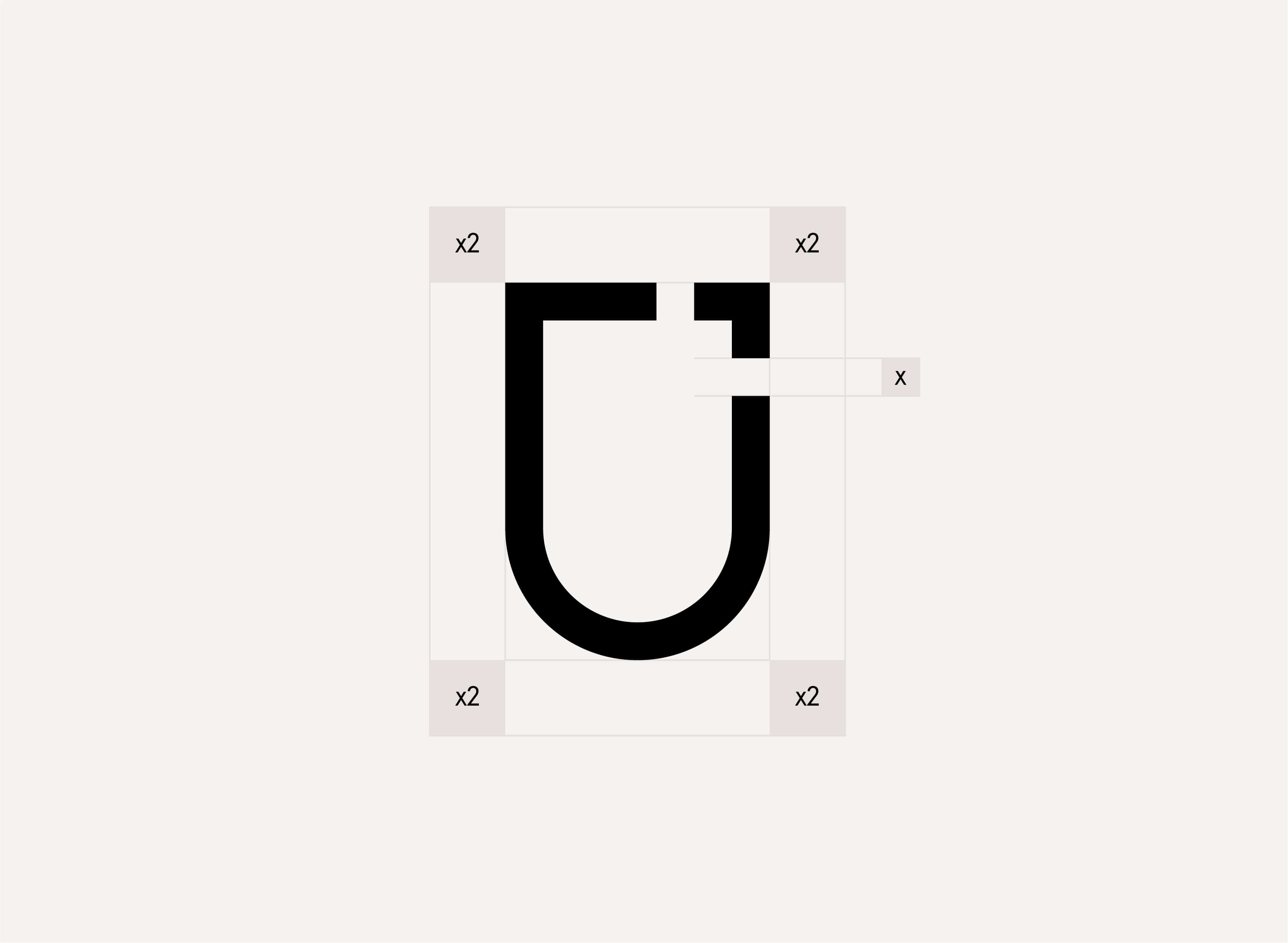
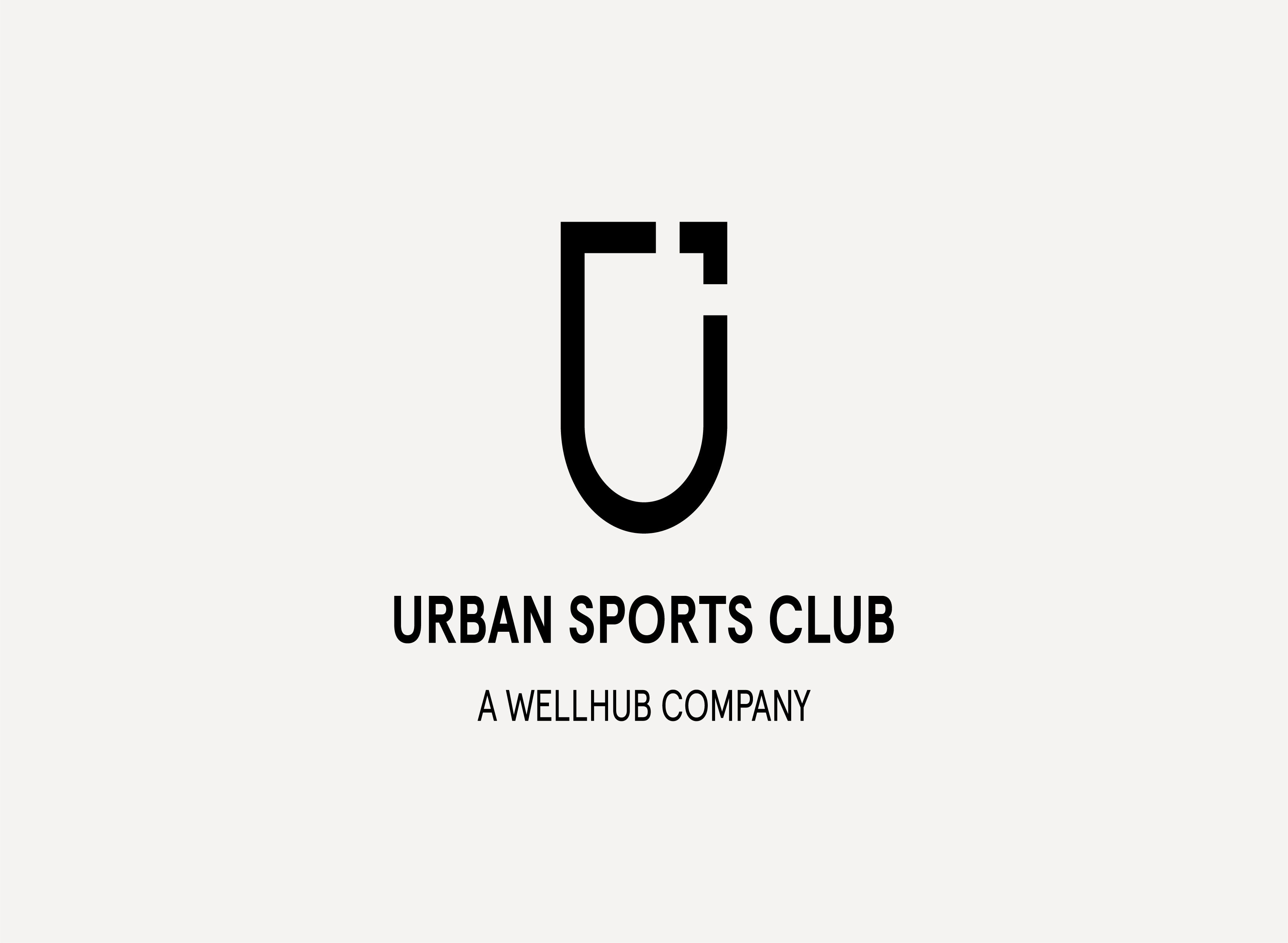
Logo

Our Unicon is a minimalistic mark, a visual representation of the values of our club. We have created a logo that is easy to use and remember. The coat of arms symbolizes our affiliation to our Urban Sports Club Community. Our visual identity is designed to inspire people to join our movement and help us get closer to our vision.

Download Logo Assets

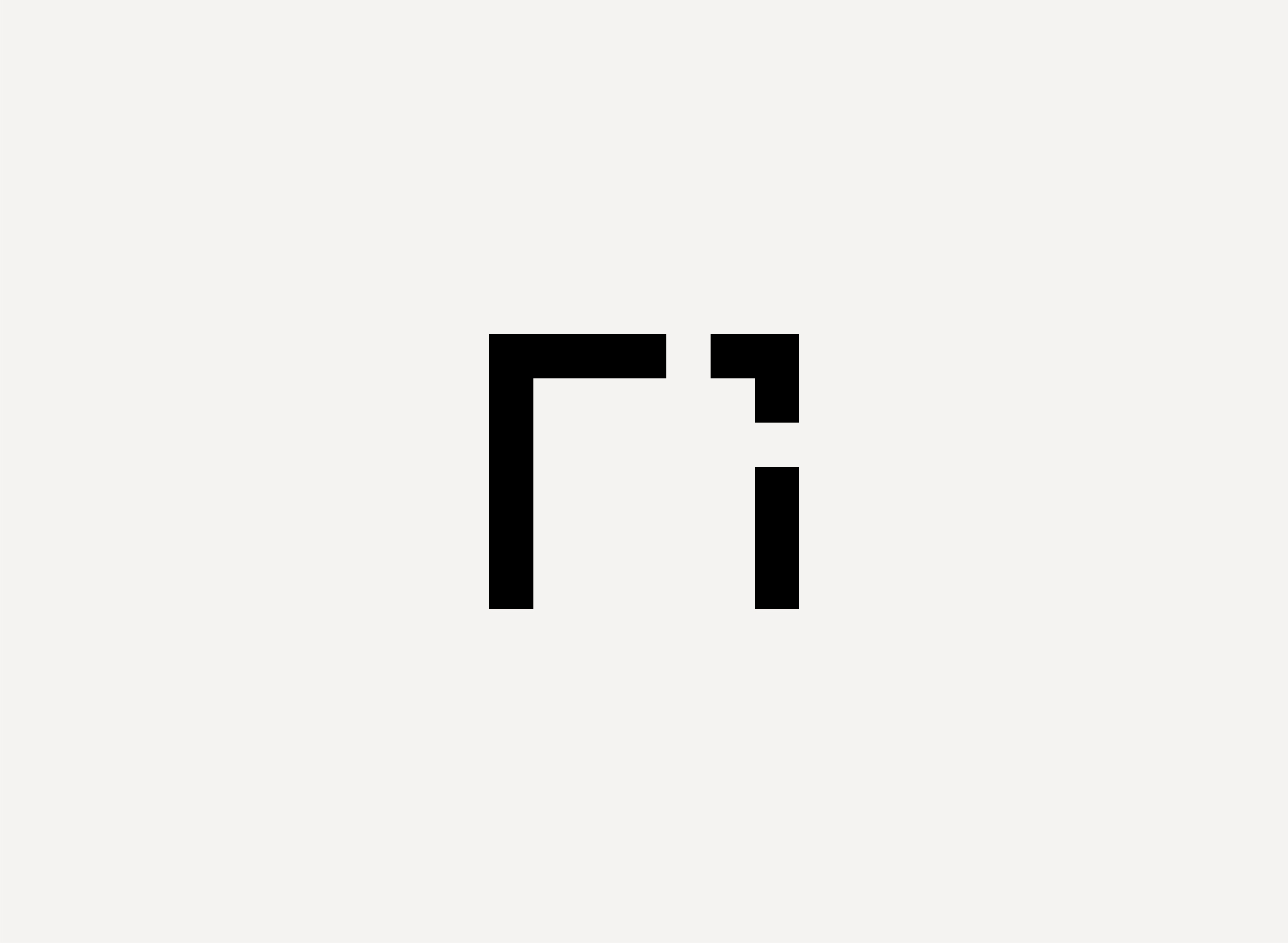
The second shape is an “Arrow” in the top right. This form provides our logotype with character and makes it unique. The Arrow is a connecting element, a visual representation of our open spirit to discover and explore the world. This element is directly connected to our values and represents the behaviour of our company trying to evolve and improve day by day.

The icon is divided into two shapes. The “U” form is the first element of our logotype. It comes from Urban, You and Us, the representation of the journey, the motion and the community. It is based on a shield - an educated symbol for clubs. It is directly connected to the idea of belonging and unity for our community.

Color Application

The logotype should only be used in black or white. If applying the logo over image or colour background always ensure the maximum legibility and contrast.

Logo Variants

The logo variants should be always considered in special cases when the legibility of the primary logo is not enough, or the format requires a different composition, or usage of the Urban Sports Club logo. The logo was tested to work at various sizes. Make sure when you apply the logo that you are over the minimum size stabilised and never go smaller than that. The minimum size guarantees that our logo is visible, legible and never compromised.

Vertical Small

This is the variant for the Urban Sports Club’s main logotype.It is the preferred go-to for most applications in case the application of the primary version is not possible due to legibility problems on the wordmark.

Horizontal

This variant should be treated as secondary and only used exceptionally for applications with an accentuated horizontal orientation.

Wordmark

This variant should be used exceptionally for applications with an accentuated horizontal orientation.

Icon-only (Unicon)

The usage of the Unicon alone is exclusive to the Brand Design Team in Berlin or following consultation.

Clearspace

When applying our logo we have to keep in mind the ‘Clearspace’.  This space is the area surrounding our logo that must be kept free of any text or graphic elements. By leaving space around the logo, we make sure it stands out in all our communications.

Example

Partnerships

For brand partnerships, we pair our logomark with a partner logo. The position will depend on who is the lead on the collaboration.Use as clearspace half of the unicon between the logos. The cross that separates both logos should have the size of the arrow.When sizing the logos, find an optical balance. Choose between vertical or horizontal alignment based on the format of communication.

Group Logos

Logo Misuse

The appearance and use of the logo need to remain consistent and coherent. In order to do that try to avoid the mistakes below.

Do not crop the logo.

Do not distort the logo.

Do not use different colors.

Do not change the transparency of the logo.

Do not use drop shadows or any other effect.

Do not rotate any part of the logo.

Logo Placement

We have established 9 ideal locations to place our logo. You are free to choose depending on the needs for each communication and format. Using these locations will ensure a coherent but flexible variety for compositions.

Usage